
A Crash Course on Color Theory and Why it Matters
Since so much of the business at Blue Parachute relies on creating designs for our clients, knowing color theory is a must. There is a science to how colors should be paired with each other and how people emotionally connect to color. We want the designs we create for our clients to be impactful for their businesses and whether we realize it or not, color theory plays an integral role in creating business success. In this article, we’ll delve into what color theory is and how you can use it to come up with the best color schemes for your business; just leave the designing to us!
To start, when discussing color there are four things to keep in mind:
- Hue: Pure color
- Tints: Hue + white
- Tones: Hue + gray
- Shades: Hue + black
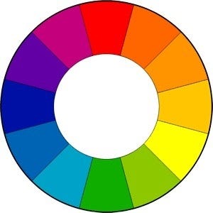
Now that we know what these are, how do we implement these four components? The color wheel is the key and it’s something everyone has seen at one point or another. It has the major primary (red, blue, yellow), secondary (purple, green, orange), and tertiary (red-orange, yellow-orange, yellow-green, blue-green, blue-violet, red-violet) colors. The color wheel is how we determine which colors go best with each other.
The color wheel allows us to create different palettes based on where colors are positioned in the wheel. Here are some examples of color palettes using the wheel:
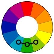
- Analogous Color Palette: Pick a color, then pick the colors on either side. This creates a harmonious design that is easy to look at.
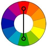
- Complementary: Pick a color on the wheel, then pick the color on the opposite side of the wheel. This is an attention-grabbing scheme that isn’t the best for website design but okay for a small app icon that should pop from the screen.
- Split Colors: Pick a color on the wheel, then two colors adjacent to the opposite color. This is also an attention-grabbing combination, but it’s easier to look at than complementary.
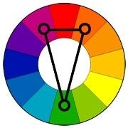
- Triadic: Pick a color on the wheel, then draw an equilateral triangle. This creates a well-balanced feel but the downside is that it can appear dated.
- Monochromatic: Pick a color on the wheel then add black and white in order to create different shades, tints, and tones. This creates a very modern look that reads beautifully on screens.


So now that we’ve gone through which colors look good together, it’s important to also know how certain colors make people feel. There’s a psychological aspect to color, as well as visual, and you can use color to evoke emotions in an audience. Warm colors, like shades of red, orange, and yellow are stimulating and energetic, while cool colors like shades of blue, green, and purple are calming. These aren’t universal associations, though.
Different cultures have different relationships with color so it’s important to keep your business’ audience in mind when designing logos or websites.
Continuing with the psychological effects of color palettes, individual colors have their own connotations:
- Red: Love, intensity, energy.
- Yellow: Joy, attention-grabbing, intellect
- Green: Freshness, safety, growth
- Blue: Stability, trust, serenity
- Purple: Royalty, warmth, femininity
Knowing these connotations is going to make it easier to design the most effective color palettes because you’ll be able to successfully combine colors to convey the right messages. But it’s important to remember how to balance colors. The more colors you add, the more difficult it will be to balance them. So simplicity is key; stick with three colors or fewer. Once you’ve decided on three colors, make sure they match in tone, shade, and tint. An easy way to figure this out is to consult the color wheel!
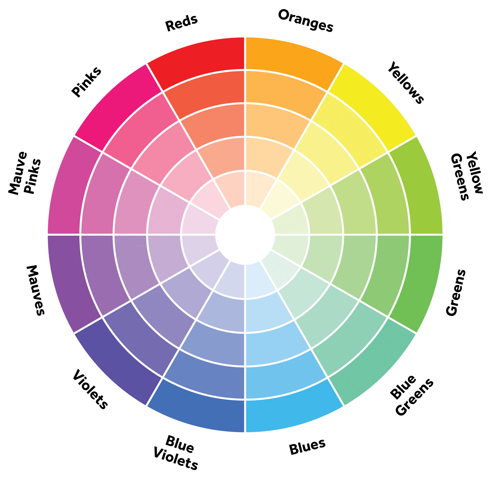
As the colors get closer to the center, more white is being added to them, changing the tint. Staying within the same tint will keep your palette looking balanced, harmonious, and professional.
Color theory can seem daunting and technical but we already have decent instincts about what looks “right.” So this just expands upon and explains why. Think about what you want your logos and printed/promotional materials to express beyond the words. Choosing the right colors, along with the right variations and groupings of them, will ensure customers remember your business positively.
Posted in: Uncategorized
Leave a Comment (0) ↓