Minimalism is Out and Nostalgia is In
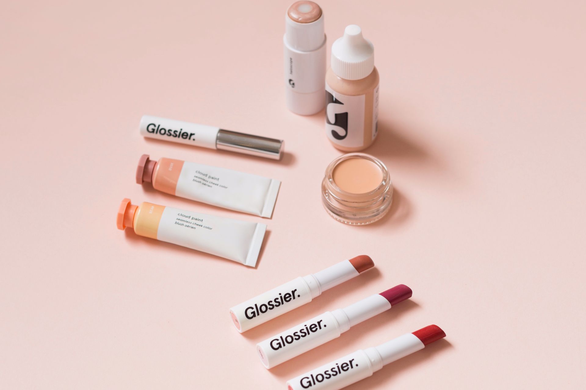
For a few years, it seems like every new brand has the same logo, the same design, the same message: We’re hip, we’re young, we’re straightforward with zero frills. At first, it was cool to see a few brands stand out in their efforts to stay minimal and modern. It evoked this desire to pare down and stick to the essentials. Translated to graphic design, that meant sans serif fonts, muted color, and flat imagery. Like being cool meant putting as little effort into your design as possible because all of the efforts were going into the products being sold.
But in the past year, brands are moving away from that design style. They’re going back in time to the age of psychedelia and they’re embracing nostalgia as the driving force behind their artwork. They’re still incorporating modern touches but the overall vibe is definitely retro.
The reason for this shift is pretty simple: people need a break. They need a break from their screens and they need a break from the constant reminders of what era we’re in. It’s a comforting homage to when things felt simpler, instead of constantly changing (in what always feels like a bad way). Typefaces are softer and more human. After Chobani redesigned to embrace nostalgia, their Chief Creative Officer, Leland Maschmeyer, said someone told him their new logo “looked like a hug.”
People need hugs right now so if brands want to tailor their imaging and messaging to this, it’s a smart move. They’ll stand out amongst the crowd and create a unique experience based on human connection, rather than “cool factor.” Do you want to take your business’ brand messaging back to the good ol’ days? Shoot us an email and we’ll be sure to take your branding from flat to far-out!
Posted in: Uncategorized
Leave a Comment (0) ↓


