
Beautiful Design is Having a Moment. Will it Last?
Historically, graphic design exists to serve a singular purpose: to convey information clearly. Designers are taught to utilize grids in their design spaces, pay attention to numbers and ratios, and keep text readable above all else (even aesthetics).
But it seems that recently, designers are challenging old standards in order to create new styles and embrace true creativity. This has manifested into two entirely different approaches: Ugly and Beautiful. We have a previous blog post about “ugly design” and its growing popularity in the design sphere but we think it’s time to talk about the other end of the spectrum.
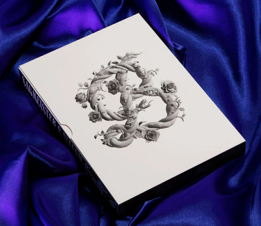
In a book aptly named, Beauty, designers and owners of the agency Sagmeister + Walsh, Stefan Sagmeister and Jessica Walsh analyze the usefulness of beautiful design. They dive deep into philosophical theory from Socrates, who believed beauty is truth and truth is beauty, to Friedrich Shlegal, who found beauty in “the interesting,” giving validation to the ugly design movement we’re seeing now.
They argue that beautiful design is actually more effective in its objectives than the bland but clear style we so often see from modern brands or on street signs. If packaging is beautiful, it will ultimately sell more units as people want a piece of that beauty.

The “Cult of Modernism,” as described in AIGA’s design blog “Eye on Design,” devalues beauty but criticism of modernism is that modernism crushes imagination and leads designers to make work that all looks the same. Modern design styles don’t convey anything individual. Even Jan Tschichold, the author of Die Neue Typographie, went on to say that modernism is “authoritarian and fascist.” If there are such rigid rules when it comes to good, effective design, what room does that leave for artists to appeal to people’s natural draw to beauty? Not to mention, the concept of beauty isn’t based in nothing. What people typically find beautiful can be measured.
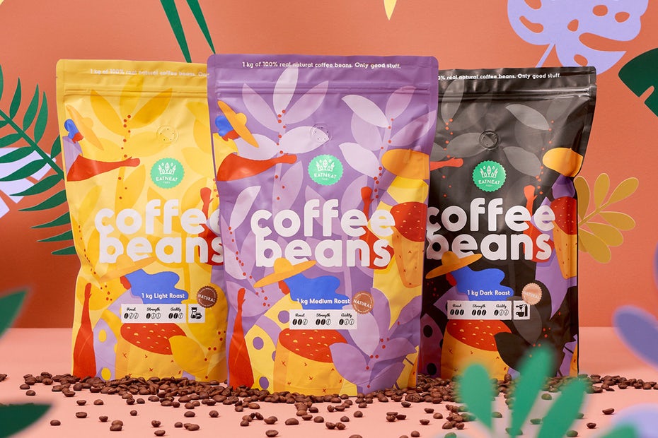
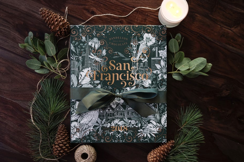
This year, we’ve seen more designs shift from the minimalist style that was everywhere for a while to a more beautiful and detailed aesthetic. From complex illustrations to painted elements and handwritten typography, packaging is becoming more personal. Brands are realizing consumers aren’t mindlessly consuming, they are maintaining relationships with brands they believe align with their own lifestyles/beliefs through their purchases. So it’s in their best interests to create designs that reflect that need to connect with consumers.
And the best way to do that is by creating something beautiful.
Letting graphic designers channel their creativity and not be bogged down by archaic design rules has ushered in a year filled with intricate and unique pieces of art lining shelves. Graphic design scholars will insist on the importance of the functionality of design over the importance of its beauty. But a new generation of designers is rejecting that old notion and creating work that is both beautiful and functional.
If your business is ready to move away from minimal in favor of a more beautiful aesthetic, let us know and we’d be happy to help!