10 Graphic Design Fails You Won’t Find at Blue Parachute
Graphic Design, in theory, is simple. Readable fonts, harmonious colors, short copy. But sometimes designers get it wrong and no one puts a stop to a bad design being printed. At Blue Parachute, we are constantly communicating with clients to make sure our work is approved, the corrections are made, and the right design makes it to the printer. Unfortunately, not every business follows their due diligence. And we’re left with some pretty hysterical results. Here are the 10 that made us laugh the most:
1. Are Your Burgers Feeling Feverish?

So, clearly, they wanted to wrap the text around the logo. But the font is giant and too wide for the paper. Or maybe some rest and OJ is exactly what your burgers need?
2. Oh, We’re Way Ahead of You:
Probably the least motivating thing to print on a t-shirt, tbh.
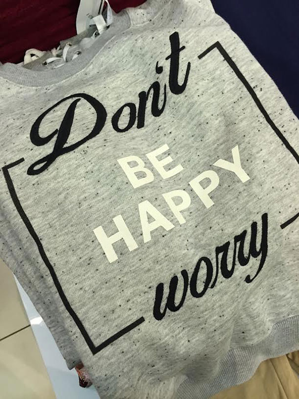
3) Don’t Forget the Extra Shake:
I refuse to believe this image wasn’t intentional. There’s just no way.
4) When You Hit Print by Mistake and Think No One Will Notice:

Not only is ‘Wander’ in a different color for really no reason, but the spacing is completely off. Someone probably should have wandered back to the drawing board before this was approved and allowed to print because we are insulted.
5) These Jokes Will Never Not Be Funny:
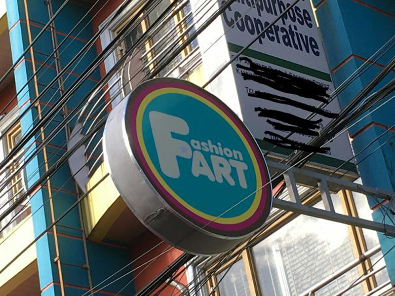
Do not use giant leading letters unless they start both lines of text. Unless this store’s aesthetic is farts, in which case, this sign is perfectly executed.
6) Looks Like They Can Help Each Other Out:

This is muddled and hard to read so maybe they should have found at least one person who knew design before mailing these bad boys out.
7) This Packaging is Nightmare Fuel:

Photos can be tricky but it’s better to cut them off than to wrap them because otherwise, this monster gets printed *shudders*.
8) Looks Like Someone Forgot How Pencils Work:
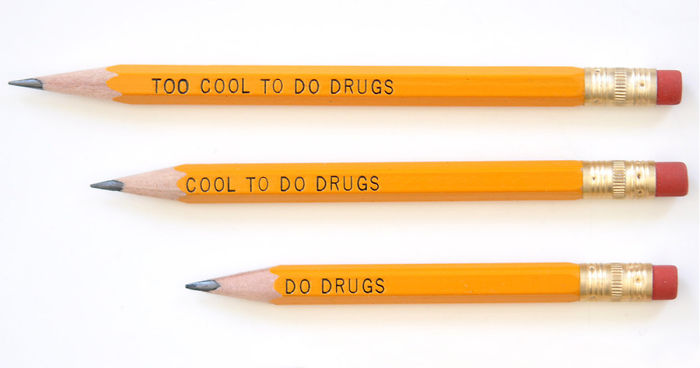
This design would probably have been better suited for pens. I don’t think I need to delve deeper.
9) Are You About That Life?:

We know what they were trying to do but it’s probably better to shell out for the extra characters, in this case.
10) Straight to the Point:

There are a few things in life that are certain: death, taxes, and the side effects of tacos. Guess they only had one ‘o’ for this sign. Two fart tacos, please.
Posted in: Uncategorized
Leave a Comment (0) ↓